vue3实现一个可以拖动的弹窗组件, 实现这个组件可以学习到什么?
背景是我们有一个老的项目jsp,他里面有一套样式规范,之前好像是使用的Bootstrap UI。
本次开发部分模块以iframe的方式嵌套进去,为了更好的维护以及迭代,我们本次技术栈使用vue3
为了满足UI统一需要定制一个弹窗组件,这个弹窗组件需要支持拖动,这个拖动还有点不太一样,是拖动了一个跟弹窗同等大小黑色的框 移动,等松开鼠标的时候再移动原弹窗的位置。具体样式如下:
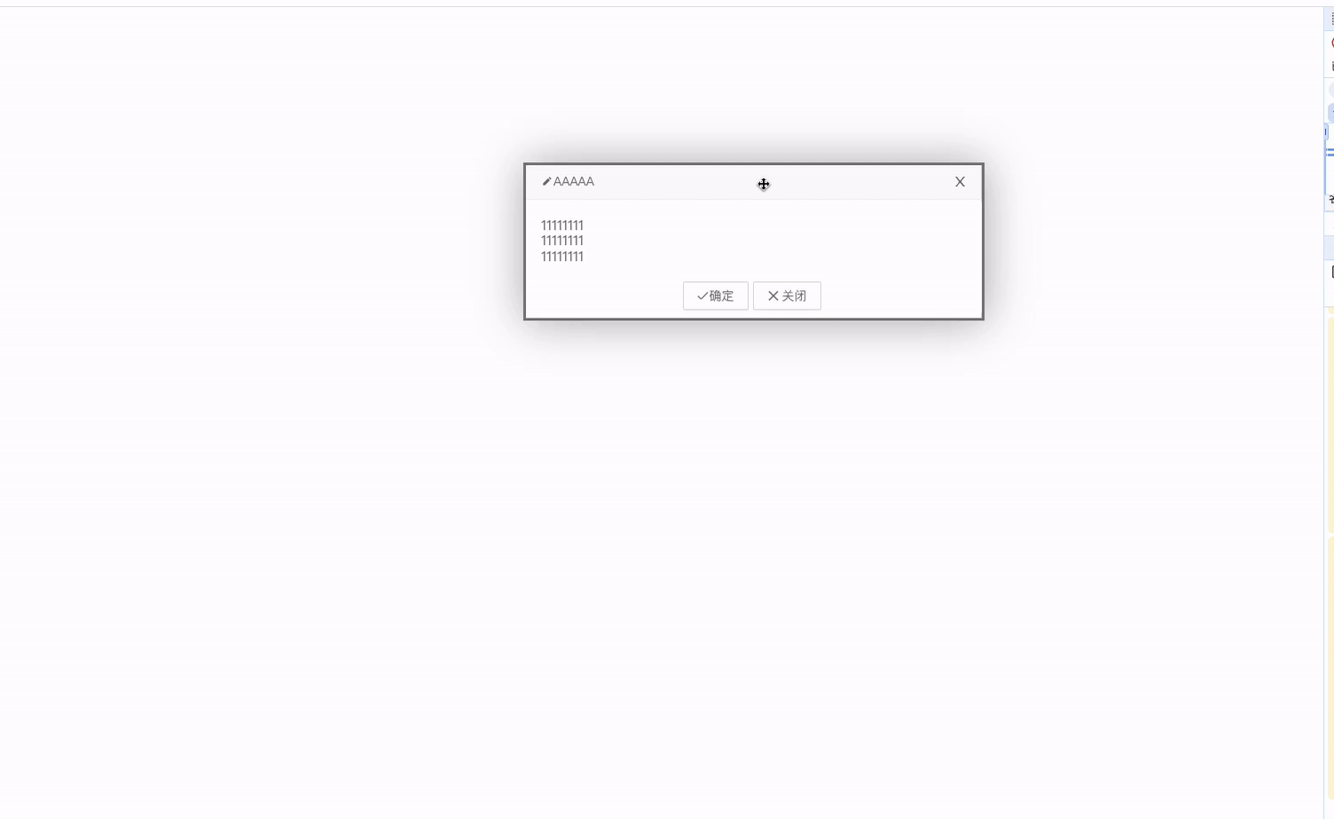
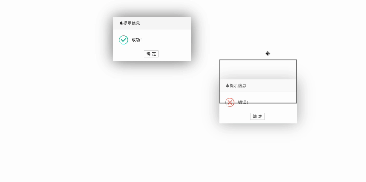
以及这个项目的二次确认弹窗,以及成功的提示也是长这个样子支持拖动,如下就是多个图标:
组件的设计 pro-modal
先说下<pro-modal />组件需要支持到什么以及需要提供给用户什么样的API,我觉得一个弹窗组件咱们直接去参考element-ui或者antd ui就行了。具体如下:
API:
title弹窗标题visible控制显示隐藏width设置宽度支持数字、像素、百分比等isFullModal是否全屏isWindowOnly是否限制在屏幕适口内拖动closable是否显示右上角关闭按钮
Slot:
defaultbodyheader定制头部左上角suffix定制头部右上角footer定制底部
用法:
<template>
  <ProModal v-model:visible="visible" title="AAAAA"> 1111 </ProModal>
</template>

<script setup>
import { ref } from "vue";
import ProModal from "@/components/pro-modal/index.vue";
const visible = ref(false);
</script>
以上就是本次
<pro-modal />组件的设计以及使用方法
基于 pro-modal 组件开发一个二次确认提示框 pro-confirm
拖拽等功能已经是
pro-modal的基础能力,pro-confirm需要支持到以下用法:
用法一:
<template>
  <ProConfirm
    content="确定删除吗?"
    :type="CONFIRM_MAP.SUCCESS"
    :confirm="onConfirm"
    :cancel="onCancel"
  >
    <a-button type="primary"> 删除 </a-button>
  </ProConfirm>
</template>

<script setup>
import { CONFIRM_MAP, ProConfirm } from "@/components/pro-confirm/index.js";

const onConfirm = () => {};

const onCancel = () => {};
</script>
用法二:
<template>
  <a-button type="primary" @click="onClick"> 保存 </a-button>
  <a-button type="primary" @click="onDeleteClick"> 删除 </a-button>
</template>

<script setup>
import { Confirm } from "@/components/pro-confirm/index.js";

const onClick = () => {
  Confirm.success("新增成功");
  /**
   *
   * Confirm.success({
   *  content: '新增成功'
   * })
   */
};

const onDeleteClick = () => {
  Confirm.warning({
    content: "确认删除吗?",
    confirm() {},
    cancel() {},
  });
};
</script>用法其实就是参考二次确认弹窗以及信息提示弹窗组件的实现,行那么接下来咱们来实现下相关具体功能。
pro-modal 实现的具体细节
处理width字段 设置宽度支持数字、像素、百分比等,匹配到数值就增加个px。如下:
const widthStyle = computed(() => {
  if (/^\d*$/.test(props.width)) {
    return `width: ${props.width}px`;
  }

  return `width: ${props.width}`;
});由于咱们的弹窗是支持拖动的,那么为了让弹窗内容居中,就不能使用margin: 0 auto;,有或者tarnsform: translateX(-50%)手段了,必须要使用定位的left才好去做拖动逻辑。
其实就是把屏幕的宽度比做一个大矩形,弹窗中的内容比做小矩形,现在需要把小矩形居中就使用 (大矩形宽度 - 小矩形宽度)/ 2 就得到*居中8的left值了。代码如下:
watch(
  () => props.visible,
  (value) => {
    if (value) {
      nextTick(() => {
        // getBoundingClientRect 获取到内容的宽度
        const { width: conatinerWidth } =
          containerRef.value?.getBoundingClientRect() || {
            width: 0,
            height: 0,
          };
        const maxWidth = window.innerWidth; // 获取到屏幕的宽度
        currentLeft.value = (maxWidth - conatinerWidth) / 2; // 得到left 值 (这里是有计算属性的,赋值后就会使用left),这里说明下我的top值初始化是100px,我看好多弹窗组件都是默认100px

        onBindEvent();
      });
    }
  },
  {
    immediate: true,
  },
);拖动黑色边框的样式也是需要计算的,它的宽度、高度、left、Top值初始化都是以弹窗内容基础去做的,然后在根据拖动的距离动态更新它的left、top值。具体如下:
const borderStyle = computed(() => {
  const { width: conatinerWidth, height: containerHeight } =
    containerRef.value?.getBoundingClientRect() || {
      width: 0,
      height: 0,
    };
  // diff 其实就是拖动的距离 动态加减即可实现拖动效果

  return `
      width: ${conatinerWidth}px;
      height: ${containerHeight}px;
      left: ${currentLeft.value + diffX.value}px;
      top: ${currentTop.value + diffY.value}px;
    `;
});会有场景需要弹窗嵌套弹窗的场景,那么就需要根据加载的顺序,动态生成权重z-index: 666;,在有弹窗存在就权重加1。具体如下:
const DEFAULT_INDEX = 698;

const indexList = [];

// 增加
export const incrementalZIndex = () => {
  const zIndex = Math.max(...indexList, DEFAULT_INDEX) + 1;
  indexList.push(zIndex);
  return zIndex;
};

// 在取消弹窗调用删除
export const decreaseZIndex = (zIndex) => {
  const i = indexList.findIndex((item) => item === zIndex);

  if (i !== -1) {
    indexList.splice(i, 1);
  }
};需要计算只能在当前屏幕内拖动,其实范围就是限制下定位的Left、Top, 最小值肯定是left: 0; top: 0;, 最大值一定是left: 屏幕的宽 - 弹窗内容的宽; top: 屏幕的高 - 弹窗内容的高。 如果有滚动条,需要把滚动条的宽度给计算进去。都在useDrag函数里面统一放下面了
import { onUnmounted, ref } from "vue";
import { getScrollBarWidth } from "./scroll-bar";

export const useDrag = (containerRef, draggableRef, options = {}) => {
  const {
    isWindowOnly = true,
    margin = 0,
    onEndCallback = () => {},
  } = options || {};

  const scopeValue = ref({});
  const isDragging = ref(false);
  const startX = ref(0);
  const startY = ref(0);
  const diffX = ref(0);
  const diffY = ref(0);

  const startDrag = ({ clientX: x1, clientY: y1 }) => {
    scopeValue.value = getScopeValue(); // 检测范围
    document.onselectstart = () => false;
    startX.value = x1;
    startY.value = y1;
    isDragging.value = true;
  };

  const moveDrag = ({ clientX: x2, clientY: y2 }) => {
    if (isDragging.value) {
      if (isWindowOnly) {
        // 判断检测要在范围内
        const { maxX, maxY, x, y } = scopeValue.value;

        const vx = x2 - startX.value + x;
        const vy = y2 - startY.value + y;

        let dx = x2 - startX.value;
        let dy = y2 - startY.value;

        if (vx < 0) {
          dx = -x;
        }
        if (vy < 0) {
          dy = -y;
        }

        if (vx > maxX) {
          dx = maxX - x;
        }

        if (vy > maxY) {
          dy = maxY - y;
        }

        diffX.value = dx;
        diffY.value = dy;
      } else {
        diffX.value = x2 - startX.value;
        diffY.value = y2 - startY.value;
      }
    }
  };

  const endDrag = () => {
    document.onselectstart = () => true;
    onEndCallback(diffX.value, diffY.value);
    diffX.value = 0;
    diffY.value = 0;
    isDragging.value = false;
  };

  const getScopeValue = () => {
    const {
      width: conatinerWidth,
      height: containerHeight,
      x,
      y,
    } = containerRef.value?.getBoundingClientRect() || {
      width: 0,
      height: 0,
    };
    const maxWidth = window.innerWidth;
    const maxHeight = window.innerHeight;
    const isScroll = document.body.scrollHeight > window.innerHeight;

    return {
      minX: 0,
      minY: 0,
      maxX:
        maxWidth -
        conatinerWidth -
        margin -
        (isScroll ? getScrollBarWidth() : 0),
      maxY: maxHeight - containerHeight - margin,
      x,
      y,
    };
  };

  const onBindEvent = () => {
    if (draggableRef.value) {
      draggableRef.value?.removeEventListener("mousedown", startDrag);
      document?.removeEventListener("mousemove", moveDrag);
      document?.removeEventListener("mouseup", endDrag);
      draggableRef.value.addEventListener("mousedown", startDrag, {
        capture: true,
      });
      document.addEventListener("mousemove", moveDrag);
      document.addEventListener("mouseup", endDrag);
    }
  };

  onUnmounted(() => {
    draggableRef.value?.removeEventListener("mousedown", startDrag);
    document?.removeEventListener("mousemove", moveDrag);
    document?.removeEventListener("mouseup", endDrag);
  });

  return {
    onBindEvent,
    isDragging,
    diffX,
    diffY,
  };
};
pro-confirm 实现的一些细节
支持嵌套点击出现确认框实现如下:
<template>
  <div @click="onClick" class="pro-confirm">
    <slot></slot>
    <ProModal
      wrapClassName="pro-confirm__warp31415925"
      :title="title"
      :icon="icon"
      :width="260"
      :closable="false"
      :visible="confirmVisible"
    >
      <div class="pro-confirm__content">
        <span class="pro-confirm__icon" :style="typeComputed"></span>
        <span> {{ content }}</span>
      </div>

      <template #footer>
        <a-button size="small" @click="onConfirm">{{ okText }}</a-button>
        <a-button size="small" @click="onCancel" v-if="showCancel">{{
          cancelText
        }}</a-button>
      </template>
    </ProModal>
  </div>
</template>

<script>
const onClick = () => {
  if (props.disabled) return;
  confirmVisible.value = true; // 更改状态 关闭
};
</script>
支持函数调用的方式使用组件(核心):
import { createApp } from "vue";
import ProConfirm from "./index.vue";

const mountNode = document.createElement("div");
document.body.appendChild(mountNode);
const modalInstance = createApp(ProConfirm, {
  visible: true,
  ...currentOptions,
  confirm() {
    currentOptions.confirm();
    mountNode.remove();
  },
  cancel() {
    currentOptions.cancel();
    mountNode.remove();
  },
});
modalInstance.mount(mountNode); // 挂载完整的方法支持success、error、warning:
import { createApp } from "vue";

import ProConfirm from "./index.vue";
import { CONFIRM_MAP } from "./options";

const DEFAULT_OPTIONS = {
  title: "提示信息",
  type: CONFIRM_MAP.SUCCESS,
  content: "",
  cancelText: "取消",
  okText: "确定",
  showCancel: true,
  confirm: () => {},
  cancel: () => {},
};

const Confirm = (options) => {
  const currentOptions = {
    ...DEFAULT_OPTIONS,
    ...options,
  };
  if (currentOptions.type === CONFIRM_MAP.SUCCESS) {
    Confirm.success();
  }
  if (currentOptions.type === CONFIRM_MAP.ERROR) {
    Confirm.error();
  }
  if (currentOptions.type === CONFIRM_MAP.WARNING) {
    Confirm.warning();
  }
};

const confirmInstance = (options) => {
  const currentOptions = {
    ...DEFAULT_OPTIONS,
    ...options,
  };

  const mountNode = document.createElement("div");
  document.body.appendChild(mountNode);
  const modalInstance = createApp(ProConfirm, {
    visible: true,
    ...currentOptions,
    confirm() {
      currentOptions.confirm();
      mountNode.remove();
    },
    cancel() {
      currentOptions.cancel();
      mountNode.remove();
    },
  });
  modalInstance.mount(mountNode);
};

const paramsParse = (options, type) => {
  let currentOptions = {
    type,
  };

  if (typeof options === "string") {
    currentOptions.content = options;
    currentOptions.showCancel = false;
  } else {
    currentOptions = {
      ...options,
      type,
    };
  }

  return currentOptions;
};

Confirm.success = (options = DEFAULT_OPTIONS) => {
  confirmInstance(paramsParse(options, CONFIRM_MAP.SUCCESS));
};

Confirm.error = (options = DEFAULT_OPTIONS) => {
  confirmInstance(paramsParse(options, CONFIRM_MAP.ERROR));
};

Confirm.warning = (options = DEFAULT_OPTIONS) => {
  confirmInstance(paramsParse(options, CONFIRM_MAP.WARNING));
};

// Confirm.success({
//   content: '新增成功'
// })

// Confirm.success('新增成功')
export { ProConfirm, CONFIRM_MAP, Confirm };
总结
实现一个可拖拽的弹窗组件以及二次确认弹窗,还是有好多细节可学习的:
widthApi兼容- 居中算法
- 权重
z-index: 666;递增 - 屏幕内拖动范围限制
- 实现二次确认弹窗
click利用事件冒泡 - 使用
createApp实现函数式APIsuccess、error、warning、Confirm